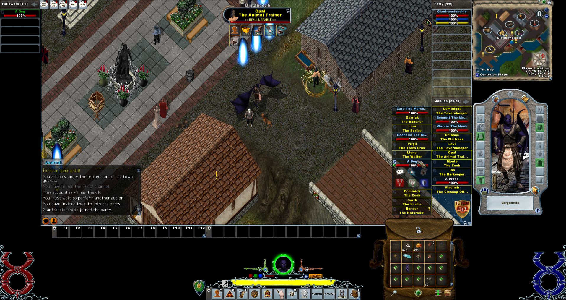
I've just got an idea for a new healthbars system, similar to the mobiles list we actually have but improved.
The idea is to have the side dockbar (like now), but with the following differences:
Let me know what do you think about it, and if you have additional ideas")
The idea is to have the side dockbar (like now), but with the following differences:
- Smaller bars: each bar will have only the lifebar with the name of the mobile over it and nothing else. As soon as you move the mouse over it, it will enlarge and show you more details (like the spells buttons, life percent, maybe even the main pet controls actions). Since you have to move the mouse over anyway to press any button, it will be quite the space saver
Possibly I can do that the bar won't enlarge if you have a target cursor. - Categories: instead of the dockspots maybe the entire thing can be scrollable (since there can only be 20 bars total anyway), and with collapsable categories (which you can move up and down to prioritize which one you want to see first). The top category will always shows the bars, the others only if you still have available slots (customizable number like now obv).
There could also be extra categories to even better filter the list like "Player Vendors", "Quest Givers", "Shopkeepers", etc...
This will also contains the party bars, so every bar will be the same.
Also each category can be set to be sorted by distance, health or simply randomly (as they appear).
Another feature will be auto-hide certain categories (which one will be customizable), when you are in combat. So for example you won't see shopkeepers while you are fighting. - Filter: like now there will be a filter, but instead it will be on top of the list fixed. This filter will also be able to find any mobile on the screen (not just the one listed)
- No more floating bars: the core idea will be to fix the issue of dragging bars around on screen, but instead giving you a "Lock Bar" button that will keep the bars in a category on top of the others. Or if you like them to be separaed from the group, we can have a secondary area where the locked bars are displayed horizontally instead of vertically (since there can only be 10). Obviously this bars won't count on the main list and you can have bars that you "drag manually" by clicking the mobiles.
The important thing is that you won't have to waste time dragging a bar around, it will simply appears in the list locked. - Button for properties: no more showing the properties on mouse over the bar, there will be a button that will do that if you put the mouse over, so you won't be distracted while targeting.
Let me know what do you think about it, and if you have additional ideas
Last edited: