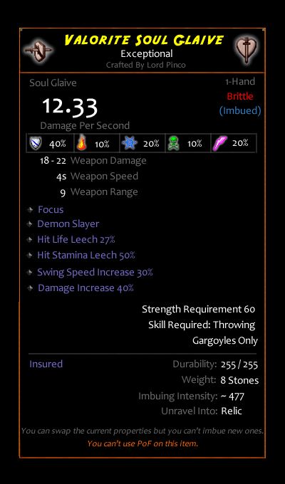
I think there is a serious problem of understanding in the item properties:

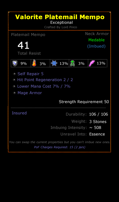
Ok, I think everyone knows what I'm talking about: if a new player point the mouse over an item and see all this mess how can understand something (and this is with my UI, in default is basically all white but the item name...)?
I'm seriously thinking to make something more user friendly, so I'd like some ideas (mock-up especially), actually I found those 2 interesting designs:


both could be adapted (with some work) to UO, but the image cannot be added here for 2 reasons:
1. The current items image inside the backpack is ugly and hard to understand what it is.
2. I can get the image only from the items inside a container.
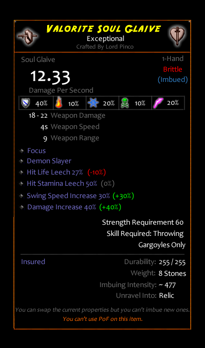
Also it could be possible to do a comparison like this (with an equipped item of the same slot):

maybe it will be less accurate...
However, i'll start to do something like this only if I see some interest. Because personally I'd rather avoid to waste a lot of hours on something that no one cares, also because when it's done there is no way back...
Ok, I think everyone knows what I'm talking about: if a new player point the mouse over an item and see all this mess how can understand something (and this is with my UI, in default is basically all white but the item name...)?
I'm seriously thinking to make something more user friendly, so I'd like some ideas (mock-up especially), actually I found those 2 interesting designs:
both could be adapted (with some work) to UO, but the image cannot be added here for 2 reasons:
1. The current items image inside the backpack is ugly and hard to understand what it is.
2. I can get the image only from the items inside a container.
Also it could be possible to do a comparison like this (with an equipped item of the same slot):
maybe it will be less accurate...
However, i'll start to do something like this only if I see some interest. Because personally I'd rather avoid to waste a lot of hours on something that no one cares, also because when it's done there is no way back...
Last edited: