
MMORPG has a great article for all the GW2 fans that are into UI's and the functionality. This has been a huge topic for alot of us GW2 fans. I have been in many debates and topics in other forums concerning the smoothness of the UI.
I have played many games and I liked the simplicity if the GW1 UI. It was definetly not overbearing and very simple to use. Warhammer Online and DaoC UI was good but had issues with to much clutter. Warhammer Online gave me a little more options in my opinion compared to DaoC but if you did not download a mod you were stuck with the standard UI when you installed the game..
MMO companies should make the UI much cleaner and easier to use especially for the casual players. Hardcore players have no issues with mods but casual players should not have to download mods to make game play easier for them. Thats actually the responsabilty of the company that forces you to pay a subscription for. What else is that subscription for if they are not putting it back into the game? Luckily for Guild Wars 2, players are not forced to pay to play the game and get great quailty gaming.
Enjoy this article from mmorpg.com and we at Guild Wars 2 Stratics would like to thank them for keeping the GW2 Players Nation well informed! Let us know what you think of GW2 UI and let MMORPG know your opinion. All comments are welcome!
Guild Wars 2 (GW2) Column: The UI - Cleaning Up the Clutter at MMORPG.com
For the click link impaired down below is the article.
The UI - Cleaning Up the Clutter
One of the things that MMO players demand any more is a customizable UI. In today's Guild Wars 2 column, we opine about ways that Arena.Net could take on the UI and make it something that players will like from the get go. Check it out and then let us know what you think in the comments.
By David North on January 24, 2012
ArenaNet has promised a lot for Guild Wars 2 and I feel like they are going to deliver, although there is one area that has not been a huge topic of discussion. That topic is the UI and functionality, and I would like to talk about it today. In the many MMOs I have played, the screen is often littered with strange boxes containing unexplained information. Sure the health and mana bars were in a familiar location, but often the UI is so cluttered I can barely see my character and the action of the game. So what can ArenaNet do to make their UI even better for Guild wars 2? Let’s take a look.
I remember the first time I played Guild Wars. It was a very refreshing to have functions that worked for me, rather than it being the other way around. The first game tried to give you all the necessary information needed in as small an area as possible and only when you needed it, to prevent cluttering the screen. Let’s first look at a simple function that was in the first game. By pressing and holding down CTRL you could view all nearby enemies. This function is increased if you have an enemy targeted, as you keep CTRL held down and either hit space or cast a spell to call it out to all your party members. This allows the players to focus fire on an enemy. This makes the information available only when you need it. Other games often require mods to have this type of functionality and to me that seems silly, as these mods often clog the screen up even more. I am hoping some of these quick button functions are brought back to the second game. It was simple, easy, and ended up being a commonly used function by all players.
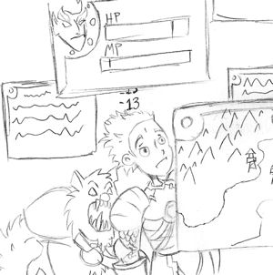
The UI should not be in the way of the action.Guild Wars had a map that was very useful. You could draw on the map to help plan your party’s attack strategy. This was something me and my fellow guild mates used in nearly every dungeon. The only issue with this part of the UI was that the drawing didn’t last very long. I would like to see a function that lets you draw on the map much like the first game, but the drawing stays on until you either enter a key command or hit a button next to the map. This lets players have more time to really review a purposed strategy. I would also like a flag system that was similar to how you controlled your heroes in the first game. For Guild Wars 2 this function would purely be to represent single, or groups of players, as there aren’t any heroes and henchman to control. Nonetheless, it may be easier to have colored flags on a map represent players on a map to save space.
When you draw on the map, please be aware that everyone can see it, even the kid in your party.With Guild Wars 2 changing how we will play and join parties, I do have a one concern with seeing how your fellow players are doing. In the first game, the health bars of your party members were displayed in a window at the side of the screen. The bar also changed color to indicate if a condition was placed on the player. In Guild Wars 2 we see that players now have avatars with health bars underneath. If a player isn’t officially in your party however, you are still working together as you are in the same fight. In videos, we don’t really see a way for you to tell the condition of your fellow players, unless they are downed which indicates that they are near death. I would like to something as simple as a mouse over that shows a player’s health bar and if any status effects are in place on that character.
The overall look for the UI in Guild Wars was pleasant and not overbearing on the screen and it was very functional. For Guild Wars 2, the visuals are much better, taking up less space and allowing us to toggle certain parts off when we aren’t using them. Without actually playing the game, one can only guess at how the UI truly functions. I do hope ArenaNet brings back some of things that made the original’s UI great, and improve upon them to potentially make the best UI out there for MMOs. But until we get to see a final version, we won’t really know.
I have played many games and I liked the simplicity if the GW1 UI. It was definetly not overbearing and very simple to use. Warhammer Online and DaoC UI was good but had issues with to much clutter. Warhammer Online gave me a little more options in my opinion compared to DaoC but if you did not download a mod you were stuck with the standard UI when you installed the game..
MMO companies should make the UI much cleaner and easier to use especially for the casual players. Hardcore players have no issues with mods but casual players should not have to download mods to make game play easier for them. Thats actually the responsabilty of the company that forces you to pay a subscription for. What else is that subscription for if they are not putting it back into the game? Luckily for Guild Wars 2, players are not forced to pay to play the game and get great quailty gaming.
Enjoy this article from mmorpg.com and we at Guild Wars 2 Stratics would like to thank them for keeping the GW2 Players Nation well informed! Let us know what you think of GW2 UI and let MMORPG know your opinion. All comments are welcome!
Guild Wars 2 (GW2) Column: The UI - Cleaning Up the Clutter at MMORPG.com
For the click link impaired down below is the article.
The UI - Cleaning Up the Clutter
One of the things that MMO players demand any more is a customizable UI. In today's Guild Wars 2 column, we opine about ways that Arena.Net could take on the UI and make it something that players will like from the get go. Check it out and then let us know what you think in the comments.
By David North on January 24, 2012
ArenaNet has promised a lot for Guild Wars 2 and I feel like they are going to deliver, although there is one area that has not been a huge topic of discussion. That topic is the UI and functionality, and I would like to talk about it today. In the many MMOs I have played, the screen is often littered with strange boxes containing unexplained information. Sure the health and mana bars were in a familiar location, but often the UI is so cluttered I can barely see my character and the action of the game. So what can ArenaNet do to make their UI even better for Guild wars 2? Let’s take a look.
I remember the first time I played Guild Wars. It was a very refreshing to have functions that worked for me, rather than it being the other way around. The first game tried to give you all the necessary information needed in as small an area as possible and only when you needed it, to prevent cluttering the screen. Let’s first look at a simple function that was in the first game. By pressing and holding down CTRL you could view all nearby enemies. This function is increased if you have an enemy targeted, as you keep CTRL held down and either hit space or cast a spell to call it out to all your party members. This allows the players to focus fire on an enemy. This makes the information available only when you need it. Other games often require mods to have this type of functionality and to me that seems silly, as these mods often clog the screen up even more. I am hoping some of these quick button functions are brought back to the second game. It was simple, easy, and ended up being a commonly used function by all players.
)
The UI should not be in the way of the action.
)
When you draw on the map, please be aware that everyone can see it, even the kid in your party.
The overall look for the UI in Guild Wars was pleasant and not overbearing on the screen and it was very functional. For Guild Wars 2, the visuals are much better, taking up less space and allowing us to toggle certain parts off when we aren’t using them. Without actually playing the game, one can only guess at how the UI truly functions. I do hope ArenaNet brings back some of things that made the original’s UI great, and improve upon them to potentially make the best UI out there for MMOs. But until we get to see a final version, we won’t really know.